What you Should know About Photographic Backgrounds | Part I
Hola|Hi|Aloha|Ciao|Salut|你
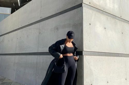
It is very common, especially in novice photographers (although it can happen to all of us), to focus so much on the center of interest of the image that we do not pay attention to what is behind it. And this, far from being an anecdote, can be so unpleasant that it can even ruin the result if some element is so disturbing that it distracts from what is really important.
Old masters photography backdrops

This can happen, as we said, especially in portraits, where it is usually essential not to detract from what in this type of photos is undoubtedly the main element of the image. Thus, a good background should go unnoticed in principle, although there is also another way of understanding it if what we want is to characterize the subject thanks to its environment.
In either case, we must take great care of the background of the photography, whether we are working outdoors or indoors, with natural or artificial light, always thinking that the combination of main subject and background is as harmonious as possible. So let’s see how to do it.

It is crucial to give as much importance to the background as to the protagonist of the photo
On the other hand, as we anticipated, although the first thing you think about is the typical portrait with a totally flat or unfocused background behind that is not distracting in the least, there is another alternative which is to integrate it into the image so that it provides extra information. For this reason, the first thing we have to think about is whether we want the main subject of the image to be related to the background or if it is just a mere scene.

A key point in deciding on a specific site is to try to eliminate all possible distractions. The best strategy is to bet on simplicity, looking for neutral funds that in no case can compete with the main subject. To do this, you have to look well for the site, properly position the model (if it is the case), decide well the focal point to use and be patient.

In principle, it is ideal to look for backgrounds with neutral colors (white, black or gray) or at least with a uniform tone and that is appropriate with the color of the protagonist. Likewise, you also have to be careful with where you place the horizon (better not «cut» the head) or any other line that may appear in the background and direct the gaze in an inappropriate way.

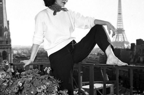
Of course, choosing well the color that predominates in the background of the photograph is another important point, in fact it can become crucial when it comes to strong colors or with a lot of personality. The essential thing here is to get the main subject and the background in proper harmony and complement each other well. To do this, we have to take into account that the background does not have an excessively bright tone that attracts attention on its own.
A good tip is to combine complementary colors between the protagonist and the background to achieve a good contrast. And this can be achieved either by taking into account the set as some detail of the subject. For example, if the predominant tones in the background are similar to those of her eyes (if it is a person), her clothes or some accessory that she wears, you will probably achieve that the relationship between both planes is harmonious and attractive.

To avoid that something in the background takes away the main element, a good way is to isolate it by blurring the background. This will be especially useful if there are many elements in the background and you cannot choose another one. To do this, you already know that you have to play with depth of field to achieve good bokeh.
The backgrounds used for inspiration are from Starbackdrop, a store of photography drop cloths with a wide variety to choose from, from light brick walls to oil painting photographs.


También te puede interesar

Tips for Choosing The Prom Dress!
5 feminist (and life) lessons we learned from María Félix